Monday, March 14, 2011

Brad and Emily

               
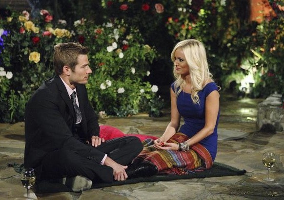
The big question arrises; will Brad Womack and Emily Maynard stay together? Like many other bachelors and bachelorettes, their relationship could fall apart. In my opinion, I think their relationship is going to last forever (if that doesn't sound too cheezy). What makes their love real is that they have had many rough moments trying to figure out if they could fit into each other's lives. Throughout the show, they constantly reasurred each other that they could make it work and ended up sharing the most amazing moments together. In the Bachelor's After the Final Rose, Trista and Ryan, Jason and Molly, and Ali and Roberto, came to give the new couple some tips. With those tips, I think Brad and Emily are sure they can make it work. Their constant "I love you's" were a testament to that. I hope the beautiful couple will continue to grow through their relationship and a have a wonderful marriage. :)

Monday, January 31, 2011

Simplicity In Designer Logos

Here are an assortment of designer logos. I am amazed how simple some of them can be and get so unique and distinct. Some (like Dior) are just a word with a certain font, and others (like Juicy Couture) have more intricate design. There is some overlapping, borders, and pictures that make each one different. The simple black lettering still reveals the essence of the unique symbols.

Wednesday, January 26, 2011

Tracking Avatar Movement

Filming a movie like Avatar is an enormous project for the graphics teams. The reason the Avatar's look so life like is based on the technology they were able to use. If you look closely, there are a bunch of tiny green dots on the woman's face in the top picture. These dots tracked her facial expressions and transferred them to the movie screen. The suits they wore while acting it out also served for the same purpose. Then the graphics filled that in creating the blue creatures that we cherish on the screen.

Monday, January 10, 2011

The Years of Starbucks Logos

Starbucks started out in 1971 just selling coffee beans. But when the owner visited Europe he saw how many coffee shops there were around. So when he came to Seattle, he made a coffee shop that sold ready made coffee. This was new. As the years went by, the name simplified. Today, we know the logo as the 1992 logo; Starbucks Coffee, two stars, green, with black around the mermaid. As of 2011, Starbucks has become so successful that the brand name isn't even included on the logo. The simple mermaid does the trick.